
28 Incredible Little-Known Facts About Famous LogosAnd if you don’t know, now you know…
Ever glanced at a logo and wondered, “What’s the story behind that?” You’re not alone! Logos aren’t just fancy squiggles or random images; they’re the beating heart of a brand’s identity. They can be mysterious, iconic, and sometimes, downright surprising!
Logos are more than just a pretty face for a brand; they’re mini-masterpieces packed with meaning. Who knew there was so much behind that little image we see every day?
Whether it’s hidden symbols or historical quirks, the world of logos is as fascinating as it is colorful. Stay curious and keep exploring the stories behind the brands. Who knows? Maybe the next logo you design will be just as intriguing!
1. The Tostitos Logo features two friends dipping the product in salsa. The “t’s” on the word illustrate friends eating a chip and dipping it in salsa, which is the dot on the “i.” Due to its subtlety, this illustration may go unnoticed, but you can’t miss it. With this simple artistic maneuver, the Tostitos brand showed it’s more than a snack. This simple snack can engender communion among friends.

2. The arrow in the Amazon logo points from the letter ‘A’ to ‘Z’, indicating that they sell everything from A to Z.

3. There’s a number 31 on the Baskin Robbins logo. Figure “31” represents the original 31 ice cream flavors that the company sold when it started.

4. The logo of Apple is in Fibonnaci series and so are its prices.

5. There’s a bear on Toblerone’s logo. Great use of the negative space makes possible the inclusion of a bear in the middle of the mountain in the Toblerone logo. The chocolate is originally from Bern, Switzerland, also known as “The City of Bears.” Hence the bear reference in its logo is a tribute to their origin.

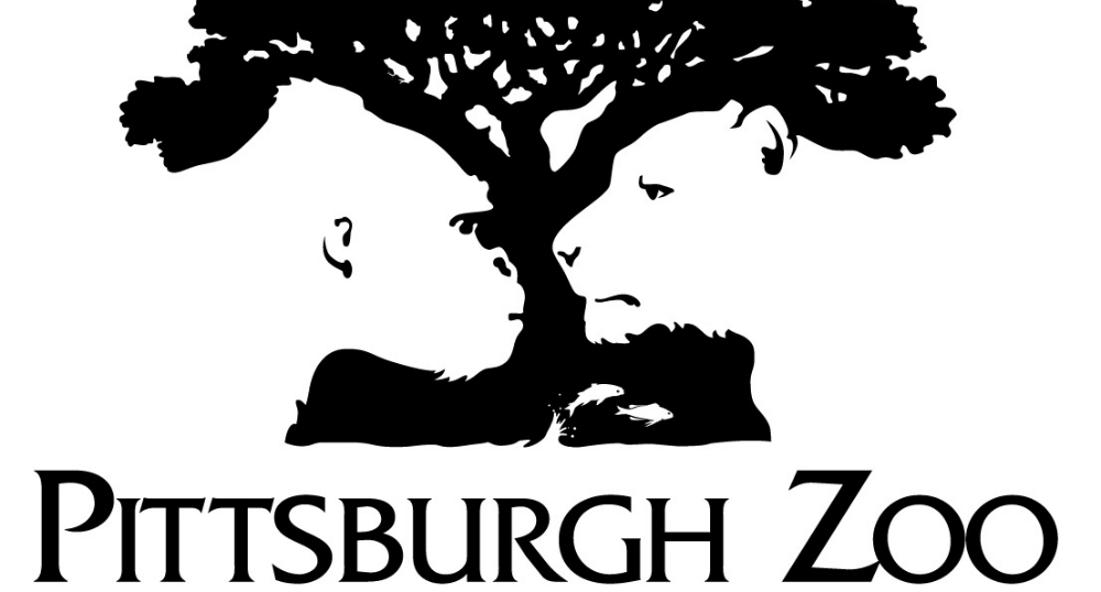
6. The Pittsburgh Zoo logo contains the faces of a gorilla and a lion in the negative space.
7. Toyota. Simply clever.

8. The BBC’s New Logo Costs $1.8 Million. When the BBC decided it was time to get rid of their old 1997 logo for a modern look, they discovered that such an upgrade would cost $1.8 million! As a result, the BBC has one of the most expensive redesigns of this era. The new logo uses the type Gill Sans Script created by Eric Gill, one of the leading sculptors of the original BBC building in London back in 1932. Indeed, it takes a true master to make complex things simple.

9. The negative space between the ‘F’ and the red stripes in the Formula 1 logo forms the number 1.

10. The three stripes in the Adidas logo represent a mountain, symbolizing the challenges that athletes need to overcome.

11. Sony VAIO has a hidden message in its logo. The VAIO logo is a stylish representation of the VAIO word, but the VA letters represent the waves that create the analog signal. The IO is a binary symbol representing two possible outcomes, on and off or input and output.

12. The blue and white sections in the BMW logo represent a spinning propeller against a blue sky, a nod to the company’s history as an aircraft engine manufacturer.

13. The negative space between the ‘E’ and the ‘x’ forms an arrow, symbolizing speed and precision.

14. The logo for the Tour de France contains a hidden cyclist within the letter ‘R’.

15. The old Twitter logo only cost $15. Today, a professional logo design could cost about $5,000, but Twitter bought its initial bird’s image from iStockphoto for $15! The artist received about $6 from the sale. After Twitter’s popularity, its logo redesign is worth approximately $100,000! The redesign is only a simplified version of the same bird!

16. The original Pepsi-Cola logo was a copy of Coco-cola logo with different letters.

17. There is “mom” written on Wendy’s collar.

18. Nike Swoosh was supposed to represent wings. The company, Blue Ribbon Sports, snowballed and made the owners consider changing the name to something more attractive but more straightforward. Founders of the brand, track, and field coach Bill Bowerman and medium-distance runner Phil Knight opted for Nike, the name of the Greek goddess of victory. In 1971, graphic design student Carolyn Davidson based the concept for Nike’s logo (the swoosh) on the goddess’s wings, representing speed. Nowadays, it’s become so recognizable that they decided to use the symbol alone.

19. Between the legs of the giraffe is the New York skyline.

20. The blue lines in the Cisco logo represent an electromagnet, symbolizing the company’s focus on connectivity and networking.

21. Greek mythology is behind the Starbucks logo. The famous logo represents a siren with two tails; the idea was to capture a part of Seattle’s seaport roots, where the company was born in 1971. In the past few years, this logo has seen significant changes, but they’ve never left behind the basic concept of the mermaid with two tails, only changing a few elements to keep it fresh. So you can say Starbucks was trying to allure customers with their beverages, as sirens do in Greek mythology with their voices.

22. The LG logo is a stylized image of a person’s face, with the ‘L’ and ‘G’ forming the nose and face respectively.

23. Nickelodeon’s most recognizable logos from 1984 – 2009 were created after the slime. This network used different variations of its orange splash logo from 1984 – 2009, representing the slime used on the TV show “You can’t do that on TV.” The original CTV series changed networks in 1982 and became an instant hit in Canada for this channel.

24. The peacock’s feathers on the NBC logo mean something. Most people notice the peacock on the NBC logo, but did you know that each one of its feathers symbolizes a division of the network? These divisions are News, Sports, Entertainment, Stations, Networks, and Productions. They are each represented by one of the logo’s 6 colors.

25. The ‘g’ in the Goodwill logo is a smiling face, symbolizing the positive impact of the organization.

26. The logo for the Milwaukee Brewers contains the letters ‘m’ and ‘b’ which form a baseball glove.

27. The letter ‘P’ in the Pinterest logo is designed to look like a pin, reflecting the nature of the platform as a place for collecting and sharing ideas.

28. The hidden Kiss in Hershey’s Kisses. Next time you look at a Hershey’s Kisses logo, check out the space between the ‘K’ and the ‘I’. You’ll spot a hidden Hershey’s kiss, right there in the logo!
